There are many systems and methods for using color in our paintings. One example, the Munsell color wheel, offers primary and secondary sets of colors that allow variety within families that are in harmony. The old saying “Value does all the work but color gets all the glory” is sort of true. If the drawing and value that underlie the painting are not correct, then the color will never look right. But you can use the “wrong colors” and still have a believable representation if you have the drawing and values correct. Unexpected use of color can evoke great emotion. Artists such as Picasso used this idea to great effect.
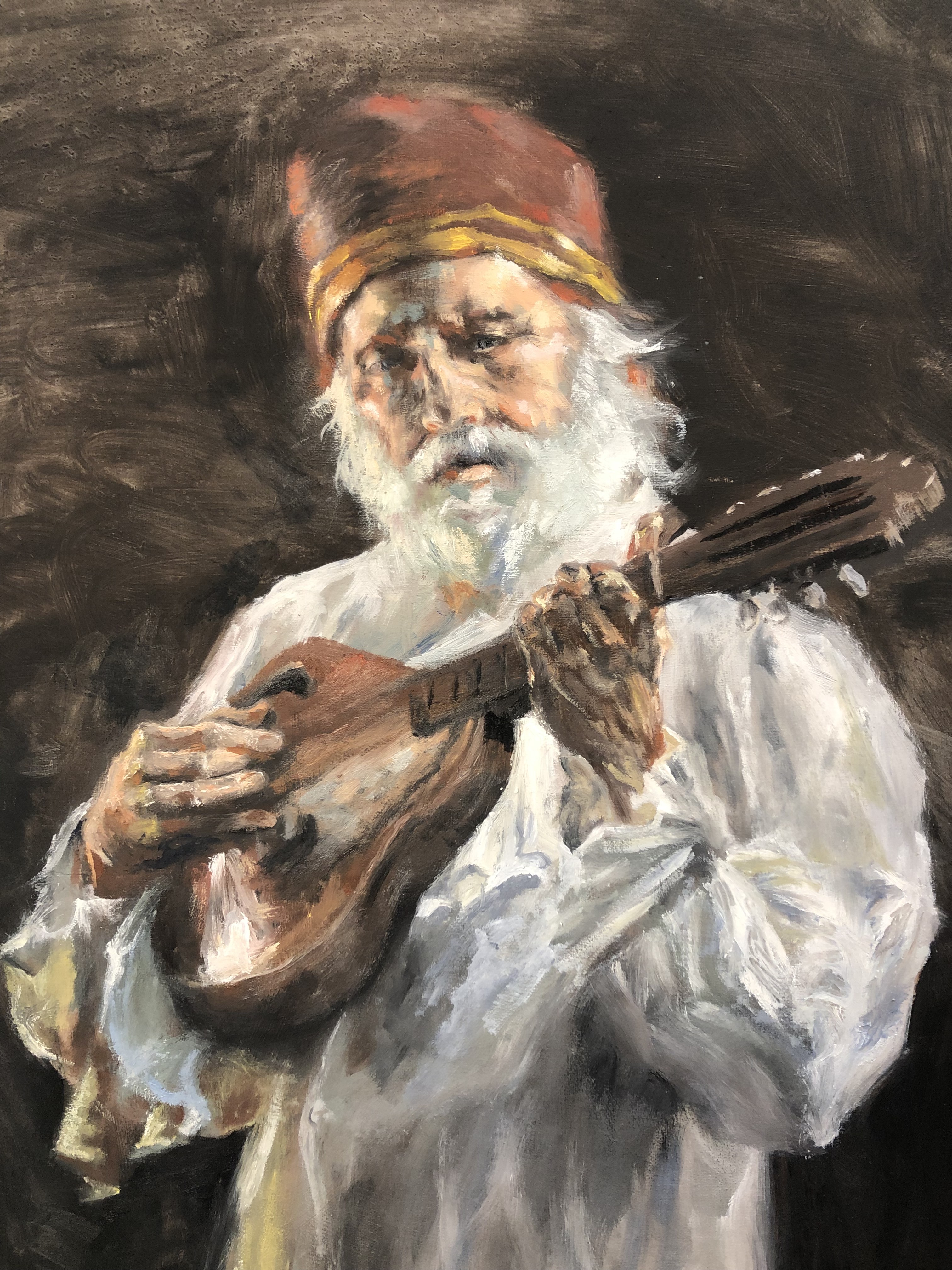
Exploring the possibilities of color is fun, but I usually come back to tried and true combinations. A limited palette will ensure that the colors are in harmony. A single color can offer a great variety within its color family. Anders Zorn (1860-1920) was a Swedish master of portraiture who often used just a few colors, usually red, yellow, black and white. Here is a painting I did using the Zorn palette, in a class with a master portrait artist of today, Rob Liberace. Hard to believe that such rich results can be had with so few colors.
 Check out my new website to more of my paintings: MickeyCarlsonFineArt.com
